Rebrand Speaks to HR Equity
With a new name, look and promise to its membership, the Human Resources Management Association’s commitment remains unwavering—to keep people first in the minds of decision-makers.
For the past two years, a core group of staff and board members have worked together with Myron Advertising + Design to explore what it means to be an HR professional today, and particularly as a member of HRMA.
What has emerged in the rebrand of the Association is at once more colourful and concise, with a first glimpse of the new brand revealed at the 2014 HRMA Conference+Tradeshow in Vancouver.
“We had the opportunity to look at ourselves as an Association and revisit our brand commitment. That goes beyond the logo of course. It begins with asking, “Are we relevant?” says Christian Codrington, HRMA’s senior manager, people practices. “Having been part of this from the start, I can tell you the logo was the last piece of the puzzle to come together. We needed to look at our deliverables. We worked with Myron to explain what HR means today and shared a wealth of member insights, surveys and feedback during this process.”
A History of Change
Without doubt, the HR of yesterday has changed, as has the face of the HR professional.
For over 70 years, what has become the pre-eminent HR association on Canada’s West Coast, has continued to grow and transform. From the creation of the War Industries Coordination Committee in 1942 to a lengthy spell as the Industrial Relations Management Association, it was not until 1992 that HR was taken to the heart of the brand with the British Columbia Human Resources Management Association.
Over two decades later, the need for further change had become apparent. With over 5,500 members spread over eight regions, BC HRMA had already reached beyond its provincial borders with the inclusion of the Yukon in 2013. Moreover, with the continued rise of HR as a strategic partner in business and growing recognition of the Certified Human Resources Professional (CHRP) designation, the opportunity existed for a rebrand with a renewed focus on the people and potency of the profession itself.
Four Strong Words Anchor Future
Myron’s account supervisor Donna Jay-Crowe, explains the brand development phase provided the opportunity “to create a clear, future-focused brand promise and key assets to begin the process of building on that promise. We sought to encapsulate the Association, the profession and the designation. As a team, we sough to avoid cliches and capitalize on the profession’s unique characteristics.”
What emerged from those discussions and explorations has become the foundation of HRMA’s new brand, grounded in four words which all involved agree reflect those unique characteristics.
“Authoritative, powerful, informative and trustworthy: those four words became the bedrock of the creative work that Myron has developed. They took those words and looked for ways to make them emote and connect,” says Codrington. “As a result, we have four strong colours that speak to the feeling those words evoke.”
More Visual Ties to Membership
Thus, the slate-hued ‘informative’ serves as the bedrock, the familiarity of blue anchors trustworthy, orange speaks to the authoritative aspect and a rich magenta conveys HR’s powerful standing and potential.
Those four strong words and hues also emerged alongside a new tagline—The Voice of the HR Profession, a new iconic logo that communicates the HR ‘bridge’, and an design focus that speaks directly to HRMA’s strongest suit—its members.
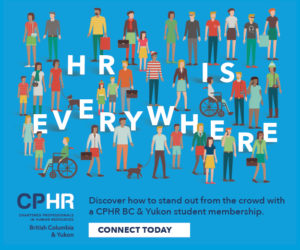
“We’re really proud of the people part and how it ties everything back to who we really are,” says Codrington. “As an association, we previously tended to rely on stock photography for our branding. That got us thinking—why not feature on our own members instead. It really works; they look great and I think it reflects well on all of us coming that much closer to actual source.”
A Name Beyond Borders
As for the newly abridged name, while there is an argument to be made that the old logo never carried “BC” to begin with, the discussions went far deeper. The renewed focus on the profession vs. the province, is not only in keeping with past incarnations of the Association, but indicative of a greater emphasis on the HR profession overall, as already evinced by the professional HR associations in Ontario (HRPA) and south of the border (SHRM).
“There were big discussions around the relevancy of our name. We looked at our equity in the marketplace and explored what new equity could be gained,” says Codrington. “What became apparent is that good people practices could not be bound by borders. We had already expanded into the Yukon. Our professional development and HRMetricsservice.org have clients nationwide. Moreover, many of our members organizations have operations in across the country, as well as in other countries. In this evolving digital economy, we needed something that spoke to the breadth of our membership offering and with clarity.”
From a full suite of redesigned membership materials to a new homepage for the Association at www.hrma.ca, the scope of the rebrand has been comprehensive—and aimed at facilitating further conversation of HR between both our membership and the broader business community.
(PeopleTalk Fall 2014)


